
Strengthened account security through a seamless multi-factor authentication workflow
Plan member accounts containing sensitive health and benefits information were protected only by basic credentials.
I led the design of a streamlined multi-factor authentication flow that added an additional layer of security while preserving a smooth, low-friction login experience.
Understanding the problem
Methods: Indirect user feedback and insights from the product manager
The existing application relied only on a basic username and password. Mobile offered optional biometric login (fingerprint on Android, Face ID on iOS), but adoption was inconsistent and not enforced. On web, saved passwords made it easy for unauthorized users to access sensitive health information, so we needed to introduce and enforce MFA.
Because the application is white-label, the solution had to respect the client's brand while still aligning with TELUS Health's internal authentication standards.
Defining key design goals
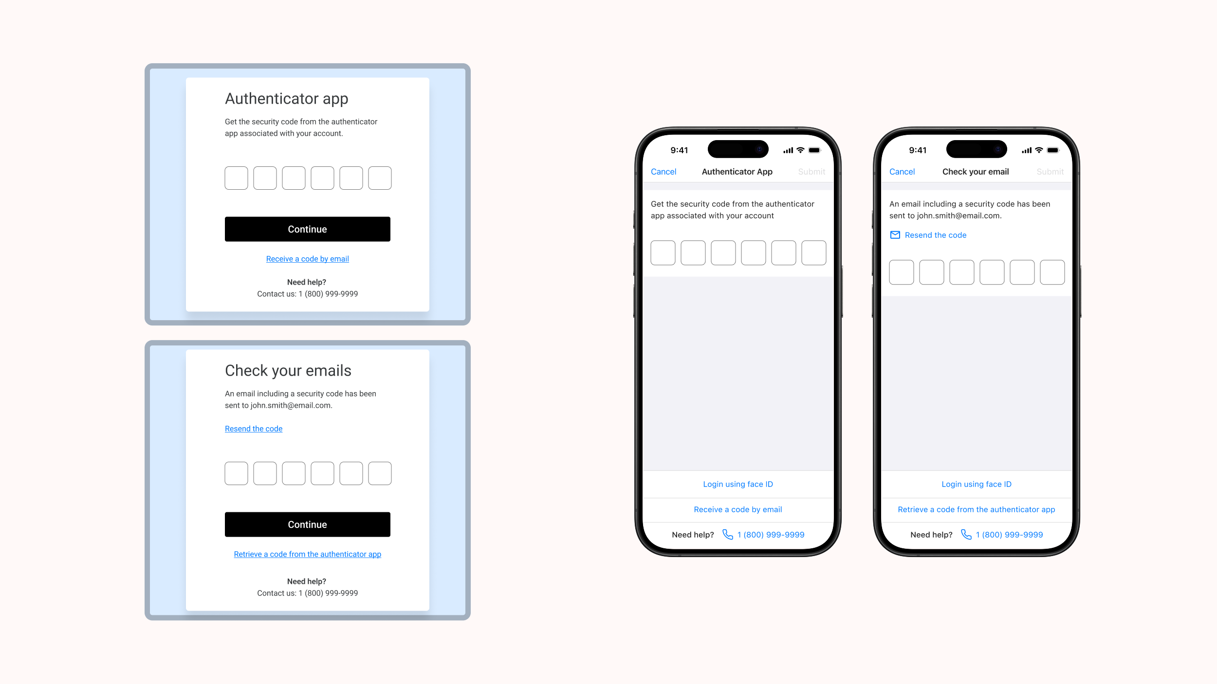
Because of time constraints, budget limitations, and available resources, the business determined that only two multi-factor authentication options would be included for this release (additional methods were planned for future phases):
- Email verification codes
- Authenticator application (e.g., Google Authenticator)
With these parameters in mind, I established the following high-level goals:
- Improve account protection while keeping the experience simple and familiar
- Adapt the internal multi-factor authentication pattern to the client's white-label branding
- Maintain consistency across web and mobile
- Deliver quickly to meet a tight timeline
Ideation & exploration
Methods: Comparative analysis with other applications, along with a review of the newest design pattern we were tasked to follow.
Although an internal multi-factor authentication pattern already existed, it was company branded. For this project, I explored ways to:
- Keep the structural logic and accessibility standards
- Adapt the visual design to a neutral, client-branded environment
- Ensure clarity between different MFA options
Iterative design
Method: Internal design reviews with the product manager, business analyst, and developers
Approach: High-fidelity mockups → Interaction flows → Iterative refinements
I created several flow variations exploring when and how multi-factor authentication should appear after login, how users select their preferred method and how fallback options could be introduced.
Through the reviews, we refined the flow to account for key constraints:
- Adjusting messaging for iOS and Android, due to differences in setting up authenticator applications
- Allowing the client to choose which multi-factor authentication methods to offer
- Defining a clear reset path for users who lose access to their authenticator application
Final design solution
I delivered polished, developer-ready designs for all key authentication flows, including:
✓ A streamlined MFA setup: A clear, step-by-step process triggered immediately after login during onboarding.
✓ Flexible method selection: Users can choose between email verification or an authenticator application, with messaging tailored to each platform.
✓ White-label compatibility: A fully neutral visual design that aligns with the client's branding while following internal authentication standards.
✓ Platform consistency: Matching flows for web and mobile to ensure a cohesive experience across devices.
✓ Clear recovery paths: Guidance for users who lose access to their authenticator application, reducing lockouts and support requests.
Outcome
Since launching, the multi-factor authentication feature was well received across web and mobile. On mobile, multi-factor authentication was thoughtfully integrated alongside existing biometric login — presenting it only when members bypassed fingerprint or Face ID.
The feature has since evolved with push notifications added by the team after my departure, and its white-label flexibility allowed each client to enable and configure it according to their needs.
Reflection
This project emphasized how important it is to keep security simple while advocating for the user experience and ensuring alignment with established patterns.