
Reduced review time for physicians by clarifying lab results structure and unifying patient context
Physicians were reviewing lab results in a fragmented interface that required constant context switching between patient details and clinical data. I led a full end-to-end redesign to improve clarity, reduce scrolling, and restore patient context within the workflow.
Understanding the problem
Methods:
- Heuristic evaluation
- User interviews
We met with the advisory committee of physicians every few weeks and PMs gathered additional insights during one-on-one clinic visits. These weren't formal research sessions — they were more open discussions to understand their workflow and collect feedback.
Physicians shared what slowed them down, what they needed easier access to and where the interface created friction. These conversations helped us identify core usability issues and better understand their mental model when reviewing lab results.
One recurring challenge was the need to constantly switch between lab results and patient context, which interrupted physicians' review flow and increased cognitive load.
Alongside this, I ran an independent heuristic evaluation to identify usability gaps.
Defining key design goals
From research, I established the following high-level goals:
- Improve readability and clarity
- Increase the number of visible lab results at once
- Reduce workflow interruptions
- Ensure consistency with the new EMR design system
Ideation & exploration
I began by exploring multiple layout variations using Figma. Early explorations included:
- Alternative lab content arrangements
- Condensed vs expanded result views
- Side panels for patient context
- Patterns for comparing multiple results over time
I quickly moved these into a high-level prototype to use in usability testing.
Through early reviews with stakeholders, we aligned on using a side panel for patient information — a pattern that was emerging across the platform and allowed clinicians to reference context without leaving the results workflow.
Iterative design
Methods:
- Review sessions with stakeholders
- Usability testing in advisory committee sessions (every few weeks)
- Feedback from clinic visits conducted by product managers
Approach: Show → Discuss → Collect feedback → Refine
I used these sessions to validate design directions, surface workflow constraints, and refine the layout based on physician feedback.
Each iteration revealed practical insights, including:
- Which result types needed priority
- What information physicians wanted at a glance
- Preferred placement for contextual lab and patient details
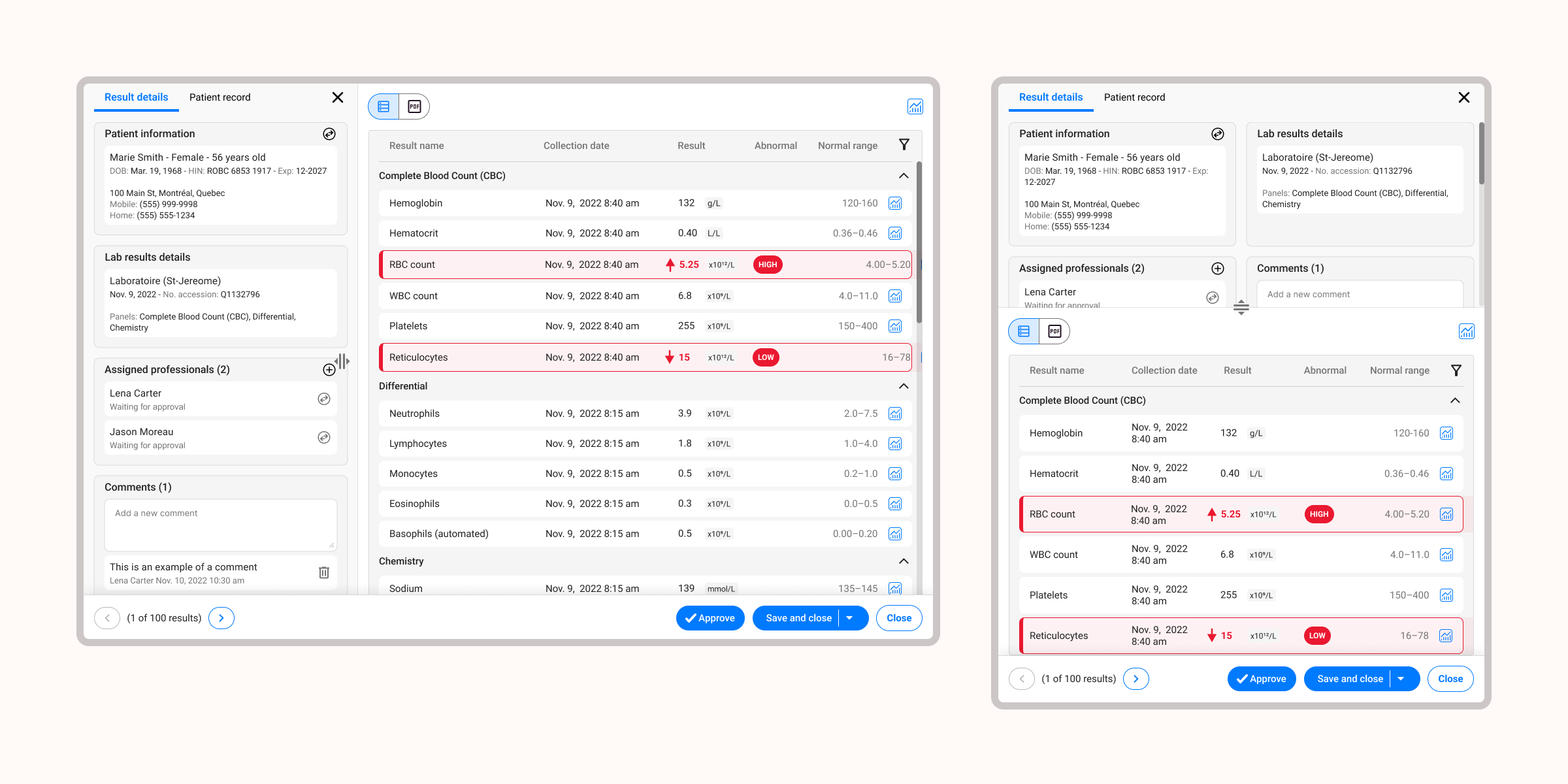
Final design solution
I delivered polished, developer-ready designs for all key flows, including:
✓ A cleaner visual hierarchy: Making critical values and trends easier to interpret.
✓ Increased data visibility: More results displayed on screen, reducing scrolling.
✓ In-context patient information: A persistent way for clinicians to view relevant lab and patient details without leaving the results page.
✓ Consistency with the EMR's new design patterns: Ensuring scalability and alignment across the broader interface redesign.
Outcome
The redesigned lab results screen has been live for several years and is used daily — often multiple times a day — by physicians across the platform.
The experience has required only minor refinements since launch, a strong signal of a design that truly fits how physicians work.
Feedback has remained consistently positive, with physicians noting the experience feels cleaner, more intuitive and better aligned with their clinical workflow.
Reflection
What I enjoyed most about this project was the hands-on collaboration with physicians. Their feedback grounded every design decision in real-world use, which is especially important in healthcare environments. It reminded me how crucial it is to design not just for clarity, but for efficiency and mental load, especially in high-pressure settings.