
Redesigned Lab Results Review for Physicians
As the UX designer, I drove the redesign of a lab results interface within an electronic medical record (EMR).
What began as a UI refresh became an opportunity to address usability issues by advocating for physician involvement and incorporating their feedback into the redesign.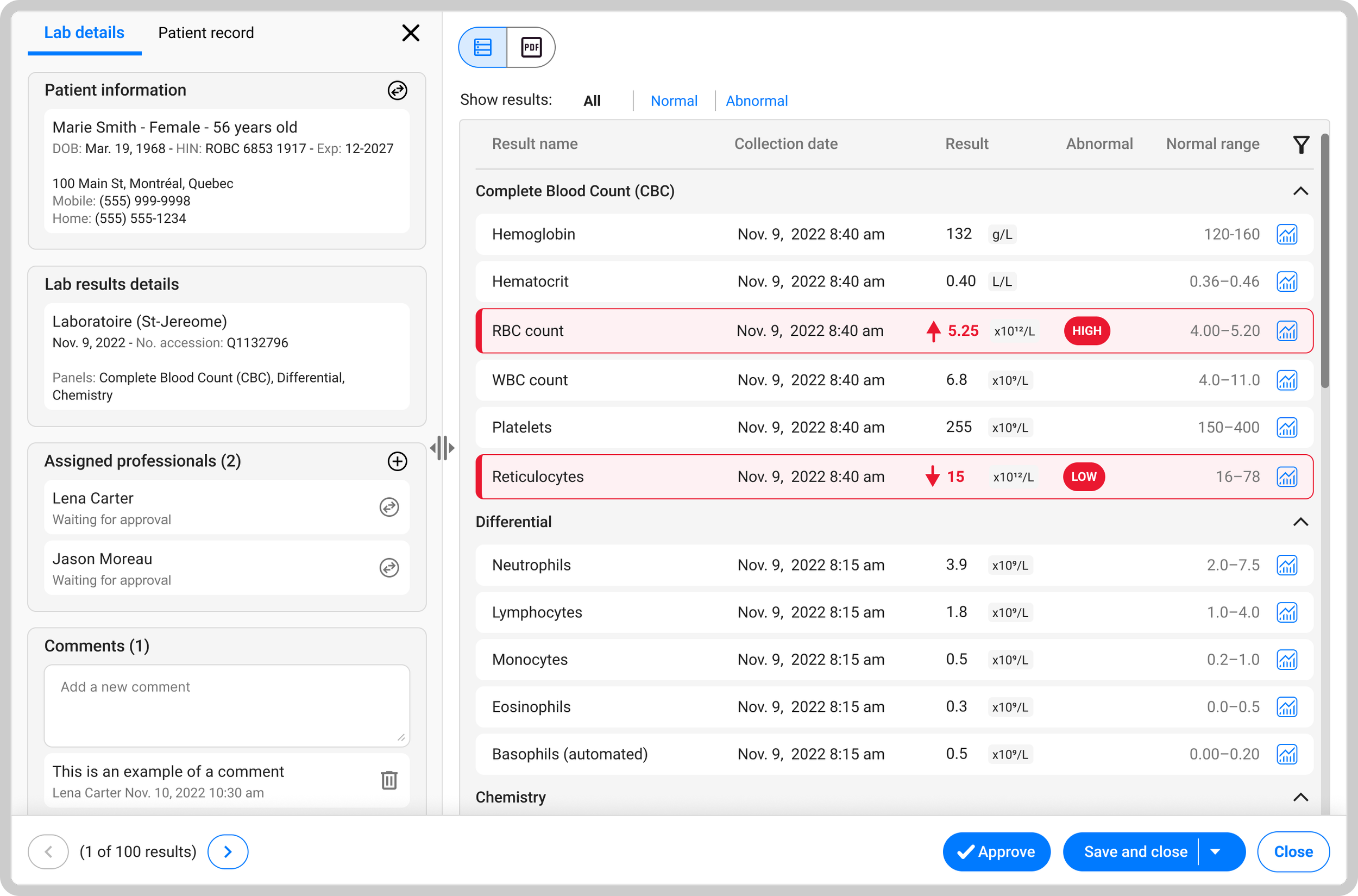
Beyond a UI refresh
The project was initially driven by a planned migration of the lab results feature to Angular. The product team saw this as an opportunity to modernize the interface alongside the technical update.
The initial objectives were to:
Migrate the lab results interface to Angular.
Refresh the visual design to align with the updated EMR design system.
The initial scope focused on technical modernization and visual consistency, leaving an opportunity to explore usability improvements beyond the original requirements.
Understanding the existing experience
The opportunity I identified
While the original scope focused on technical and visual modernization, I advocated for involving physicians to identify usability issues and opportunities for a more meaningful redesign.
To build a more complete understanding of the existing experience, I gathered insights through several activities:
Took advantage of the physicians advisory committee to gather feedback on the existing experience and proposed designs.
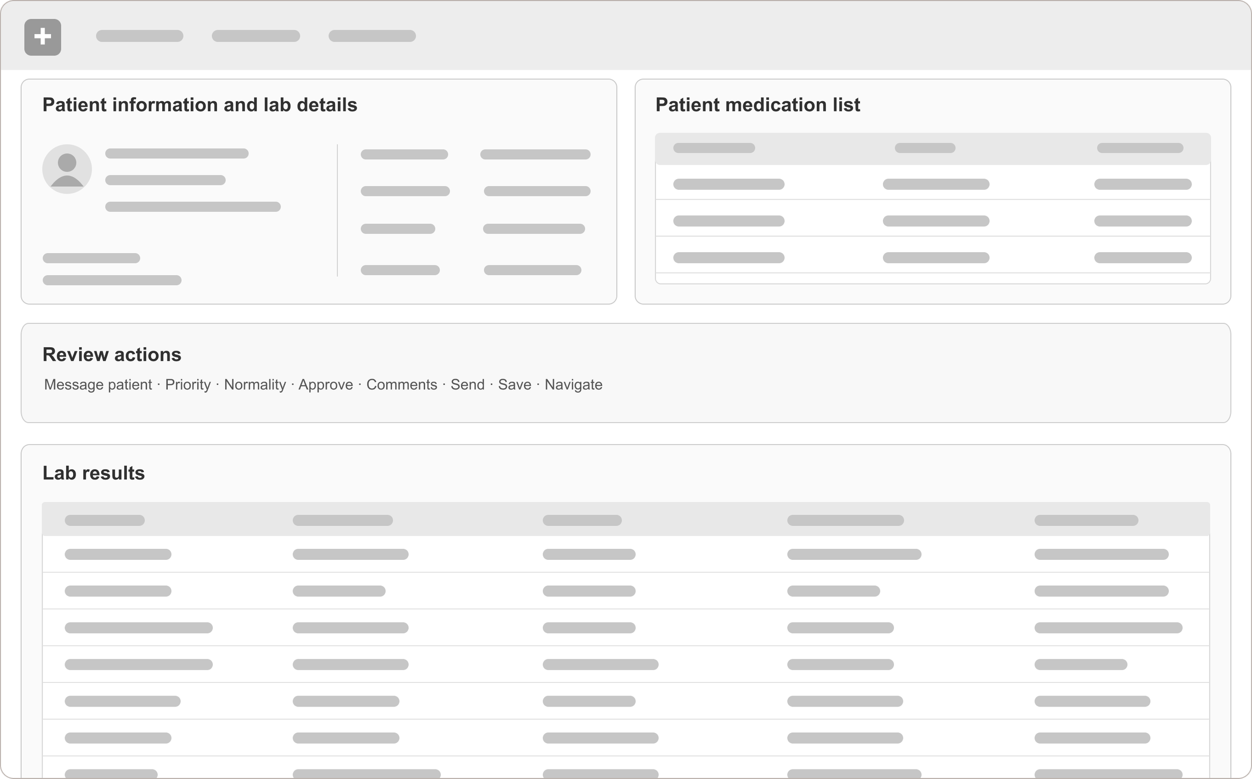
Documented the existing lab results review process using insights from physician advisory sessions and the product team to map the steps and interactions involved.
Identified usability issues related to information hierarchy, navigation, and readability.
Reviewed how another EMR within the company presented lab results to inform the redesign.
Mapping the existing interface helped illustrate how patient information, review actions, and lab results were distributed across the screen.
Key findings
Fragmented patient context
Patient information and lab results were spread across different areas.
Excessive scrolling
Limited the number of results physicians could see at once.
Dense clinical information
Made abnormal findings harder to identify quickly.
Interrupted workflows
Switching between information and tasks disrupted reviews.
Less scrolling, clearer results, better context
Layout & patient context
- Reorganize the workspace: Moved patient information and lab details into a dedicated side panel, giving lab results more room.
- Preserve patient context: Integrated patient record summary cards into the left side panel, keeping relevant clinical information accessible throughout the review.
- Maintain consistency: Reused an established EMR pattern from a previous redesign and centralized review actions in a bottom toolbar.
Result visibility & review
- Improve result visibility: Displayed more lab results at once, reducing the need to scroll.
- Highlight abnormalities: Combined row highlighting, directional arrows, and high/low labels without relying on colour alone.
- Support focused review: Enabled physicians to filter between normal and abnormal results, making it easier to focus on findings that need attention.
Beyond the refresh: Delivering lasting value
The redesigned lab results interface was successfully launched and remains in use several years later, meeting the original modernization goals while addressing key usability issues.
Business goals delivered
Supported the Angular migration and alignment with the updated EMR design system.
Positive feedback
Physicians responded positively during advisory committee sessions.
Improved experience
Addressed usability issues related to scrolling, readability, and patient context.
Looking beyond the original requirements
This project reinforced the value of advocating for users, grounding design decisions in real clinical workflows, and prioritizing clarity in complex healthcare experiences.
Back to top ↑